
Evaluating the Aesthetic Appeal of AFL Guernseys
The guernsey in Australian Football League (AFL) is more than just a piece of clothing; it's a symbol of identity, tradition, and creativity. While some clubs have maintained their classic designs over the years, others have embraced modern re-designs to keep up with evolving trends. This article explores how different teams have approached their guernsey designs, focusing on colour schemes, patterns, and overall visual appeal.
GWS Giants
The GWS Giants' guernsey features an orange base, which is notoriously difficult to make visually appealing. However, the team has made an effort to incorporate all their colours into the design, adding some texture to the pattern. Despite this, the guernsey still feels unbalanced, with the large "G" appearing overly aggressive and forced.
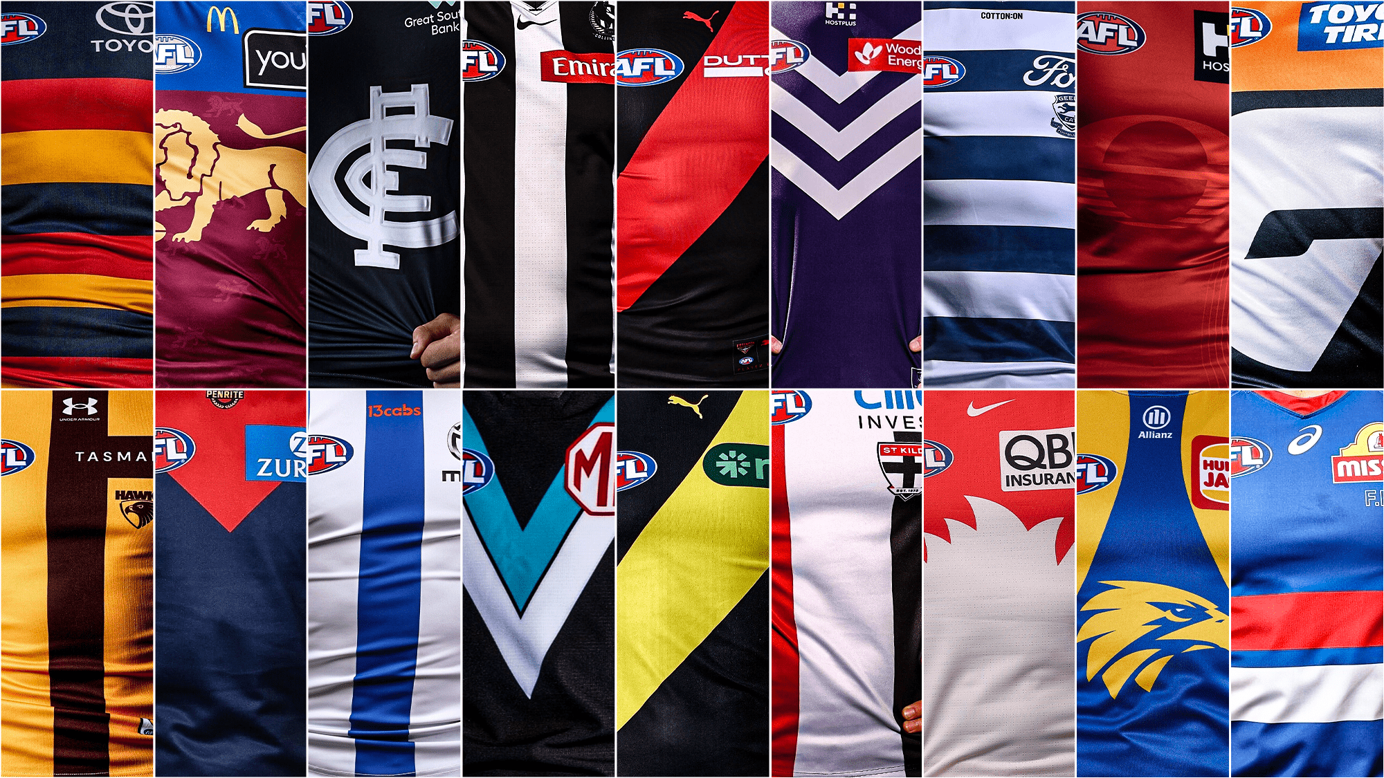
Gold Coast Suns
The Gold Coast Suns' guernsey is one of the least impressive on the list. It's predominantly red with minimal use of yellow, and there's little to no pattern or visible team logo. This lack of creativity makes it one of the most uninspired rebrands in recent years.
Adelaide Crows
Adelaide's current design is a significant downgrade from its previous version, which featured the iconic Crow emblem. The navy blue and red combination works well, but the addition of yellow on the sleeves and between the stripes detracts from the overall aesthetic.
St Kilda Saints
St Kilda's guernsey is simple, with three horizontal stripes, but it lacks any real pattern or detail. The sponsor logo, which is an out-of-place glaring blue, further diminishes its visual appeal.
Hawthorn Hawks
Hawthorn's guernsey uses a mustard-like shade of gold, which doesn't quite capture the club's traditional golden hue. The brown accents help to balance the design, but the excessive use of yellow makes it less appealing.
Carlton Blues
Carlton's guernsey is iconic, but its simplicity has led to controversy. While the navy-blue base is a classic choice, the design is essentially a logo slapped onto a uniform. However, the contrast between the logo and the base is effective.
West Coast Eagles
The West Coast Eagles' guernsey is a step up from many others, with a better use of yellow and a pattern that reflects the club's mascot. A darker blue could have elevated this design even further.
Geelong Cats
Geelong's guernsey is one of the cleaner looks, with logos neatly aligned and a prominent use of white. The heritage logo adds a touch of history, making it a standout among modern designs.
Port Adelaide Power
Port Adelaide's teal guernsey is unique and attention-grabbing, standing out against the usual black and white combinations. The red MG logo is a minor issue, but it blends well with the overall design.
Richmond Tigers
Richmond's guernsey is a toss-up between two designs, with the NIB logo being a point of contention. Its green hue clashes with the rest of the kit, making it less appealing.
Essendon Bombers
Essendon's red and black combination is a strong one, with the dash across the black adding a subtle touch of style. The sponsor logo is not overly distracting, making it a solid choice.
Western Bulldogs
The Western Bulldogs' guernsey is one of the best examples of a successful sponsor and team logo mix. The Mission and AFL logos match the Bulldog colours perfectly, creating a minimalist yet effective design.
North Melbourne Kangaroos
North Melbourne's guernsey features striking blue and white stripes that have been a fan favourite for years. The silver Mazda logo curves around the design, blending seamlessly with the rest of the kit.
Fremantle Dockers
Fremantle's guernsey successfully incorporates purple, a colour often avoided in sports. The dark purple and white anchor pattern is a modern take on the club's heritage, with the exclusion of green being a wise decision.
Collingwood Magpies
Collingwood's prison bar design remains a classic, and for good reason. It's simple, versatile, and has stood the test of time, making it one of the most iconic guernseys in the league.
Melbourne Demons
Melbourne's guernsey features a dark blue that blends well with the red on the chest. The additional logos are well-integrated, creating an intimidating and cohesive look.
Sydney Swans
Sydney's guernsey is a great example of balancing heritage with modernity. The V-strip design nods to the club's South Melbourne roots while incorporating a contemporary twist with the opera house silhouette and swan feather motif.
Brisbane Lions
Brisbane's guernsey is a vibrant mix of Fitzroy colours and Brisbane blue. The lion silhouette is a standout feature, with the regal gold complementing the sleeves and the blue providing a subtle background.


No comments:
Post a Comment